ShopDreamUp AI ArtDreamUp
Deviation Actions


Suggested Deviants


Suggested Collections


Description
THE FILE IS LARGE. HIT DOWNLOAD TO SEE IT IN FULL SIZE.
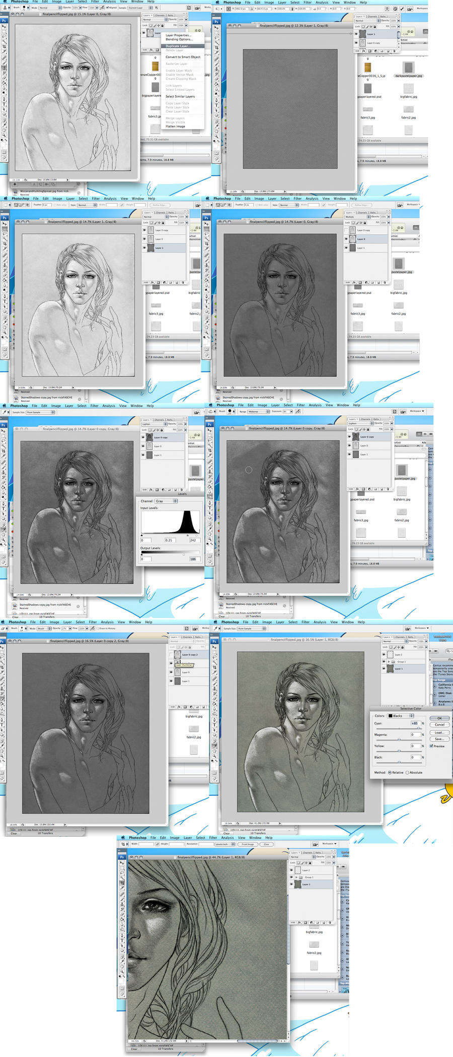
Here is where everything gets really difficult.
NOTE: I AM NOT DOING A FULL TUTORIAL HERE. I'm just telling you how I do things. If you are confused about something I'm talking about feel free to ask without begging for explanation as to what photoshop does, otherwise there are plenty of actual photoshop tutorials out there. This process review is laid out assuming some knowledge of photoshop already.
Okay so basically, this is my pre-coloring prep in photoshop. Start with a drawing-> create a layer from background ->duplicate the drawing layer -> Paste the desired texture underneath both, in this case scanned dark pastel paper.
Now here is where it gets complicated.
I like to use the darks and lights separately.
So I hide the topmost layer, and put the bottom drawing layer on multiply. Oftentimes I mess with the levels tool to get the desired depth of shadow.
Then I turn the top layer back on, and put it on lighten/screen/color dodge/linear dodge depending. Each drawing looks better on different layer compositions. This time I used lighten. Now, you can see the grey paper is light enough to be an ass and show as well. NO PROB. I just attack that bitch with the burn tool set on midtones to get rid of excess texture. Sometimes it works to just equalize the drawing more, but this time that blew out the whites too much, so this worked better.
I believe I ended up equalizing the entire drawing to leave some paper texture there, but there is the final result. HOSHIZ IT LOOKS LIKE I DREW ON THAT PAPER! only not. Cuz that paper looks nice, but it is near impossible to draw with pencil on.
Hence all this crap.
NOW. XD
I like to tone the texture first, depending on the palette I'm planning on. It's best to do this first in my case, because this will change the coloring over top when I start painting, in a very annoying way, if I don't start with it.
I like to use the selective color tool, because, as you can see at the bottom there, you get a nice effect by toning neutrals differently from blacks :3 And it makes the texture stand out more with COLOR!
Now on to actually painting.
Image size
1073x2500px 1.58 MB
© 2010 - 2024 shley77
Comments14
Join the community to add your comment. Already a deviant? Log In
do you have a downloadable paper texture like that?? It's beautiful!
Also, although I've said this on your profile page I will say it again - your style is beautiful!!
Also, although I've said this on your profile page I will say it again - your style is beautiful!!